Building AEDIT’s Design System
Date
03/2020 - 04/2021
Company
AEDIT LLC
Product type
Design System
My role
Lead product designer
AEDIT’s product team started out with 2 product designers and a small component library in Sketch. As the company grew, the size of the team triples, which brought some new opportunities and challenges at the same time.
Rebranding: In early 2020, AEDIT brand team started a rebranding exercise, exploring a fresh take on our brand identity and voice. A new brand guideline was developed to serve the new business goal.
More designers have joined the team: our design team is now a squad rather than a duo, and we’re hiring for more.
From Sketch to Figma: We set out to move our design tools stack from Sketch, InVision, and Principle to Figma, Figma, and Figma.
Where we started
Based on the challenges listed above, it becomes clear that a unified design system on Figma is needed to manage the chaos of the transition process, maintain consistency across different products and platforms, improve collaboration and facilitate the onboading process for new hires.
As a former linguistic student, visual language is like any other language to me. Building a design system is like compiling a dictionary or grammar book. As the team grows, having a design system gets more important as many people start to learn and use this language.
This is how I understand the basic structure of a design system based on its similarity to a language:

Process
As one of the designer duo at the beginning, I helped our lead product designer manage the small component library in Sketch age. This time we have the chance to build a design system from scratch. She has contributed lots of great work compiling and documenting the patterns for the responsive website, and I’ve been focusing more on the mobile and native app.
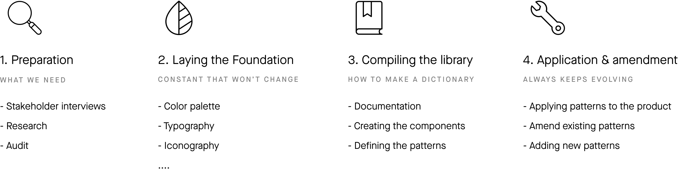
We broke our design process into 4 phases:
Preparation
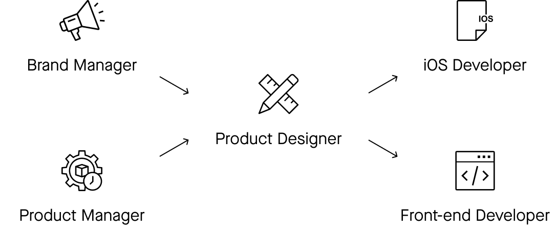
To figure out what should we keep in our design system and how to structure it, I conducted several stakeholder interviews. I discussed the project plan with product managers, making sure all the requirements and tickets were covered; I went over brand guidelines with our brand manager to lay the foundation for the design system library; I also talked with developers from both iOS and front-end teams, and familiarized myself with their regular workflow and tools they used when it came to implementing the design.

I did some research on other design systems, such as Apple HIG, Google Material Design, Adobe Spectrum, IBM Carbon Design System, and a couple more.
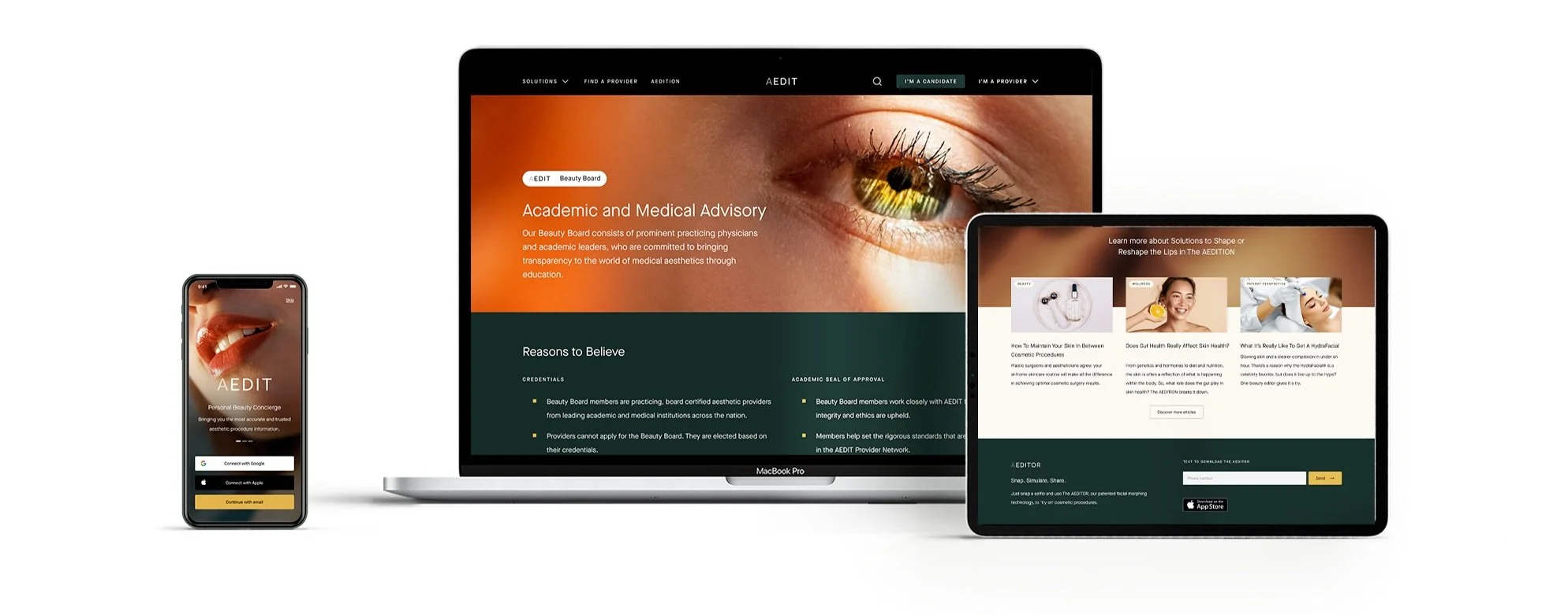
I also audited our website and AEDIT app . I put together many of our designs, both old and new. Laying the flows side by side on a board, we could see the patterns emerging, and what else we need to include in our design system library.
2. Laying the foundation
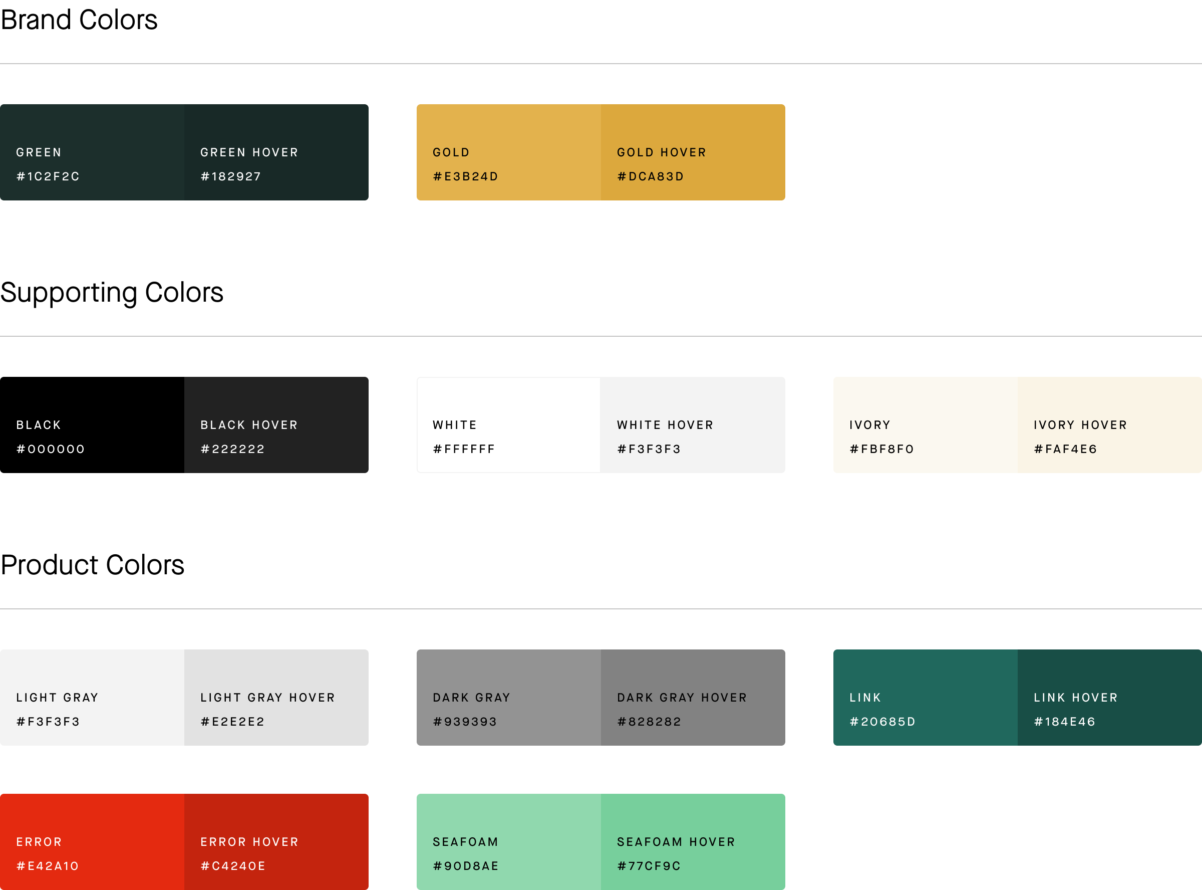
Based on our brand guidelines, we put together a basic style guide as the foundation of our design system. This foundation loosely defined our color palette, typography, iconography, spacing and grid system. The foundation serves as the “constant“ in an evolving design system. As we keep adding new patterns to the library, the foundation usually won’t change too much. It guides our work in a unified direction, and always keeps us on track with our brand guidelines.
Iconography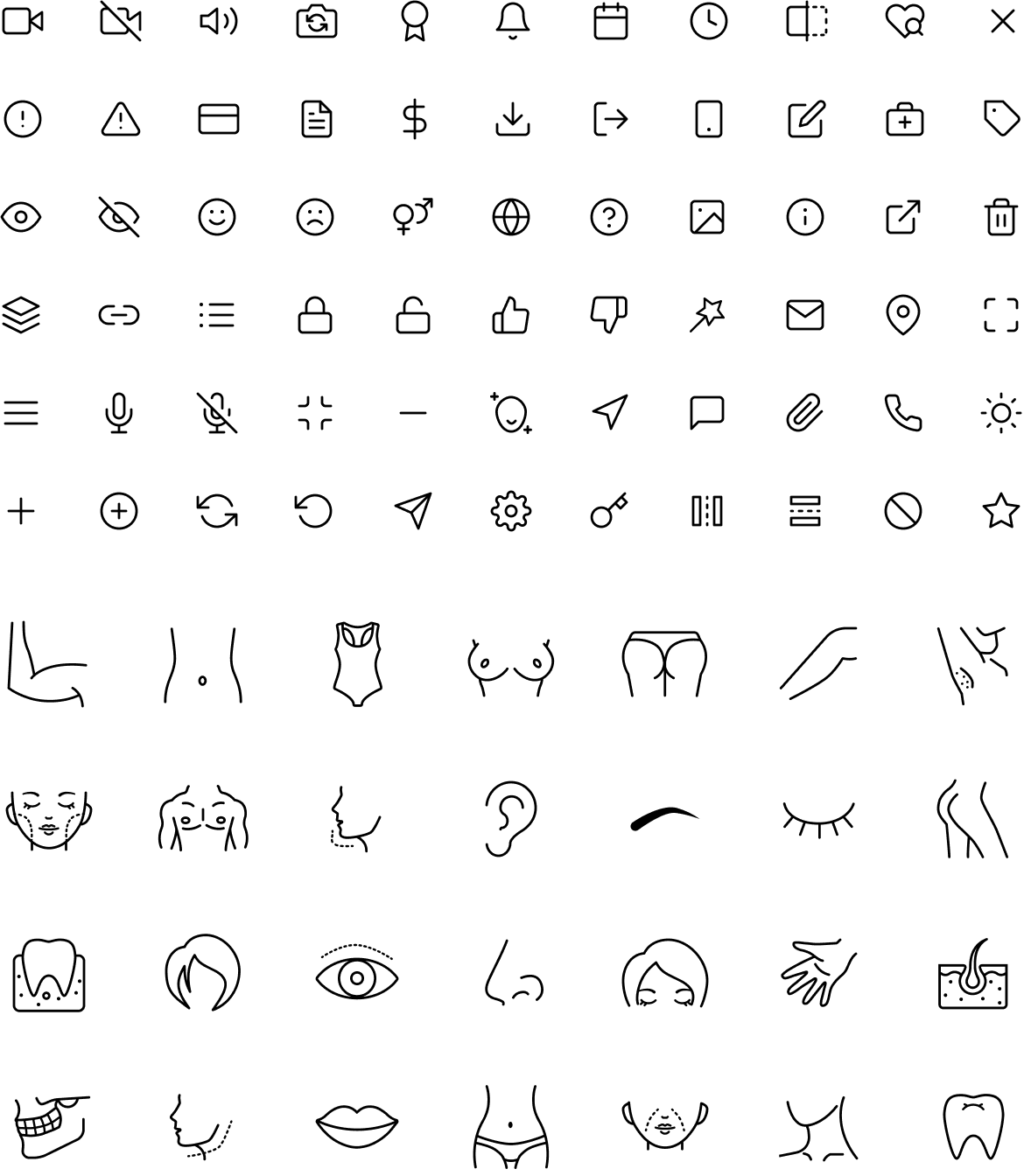
Typography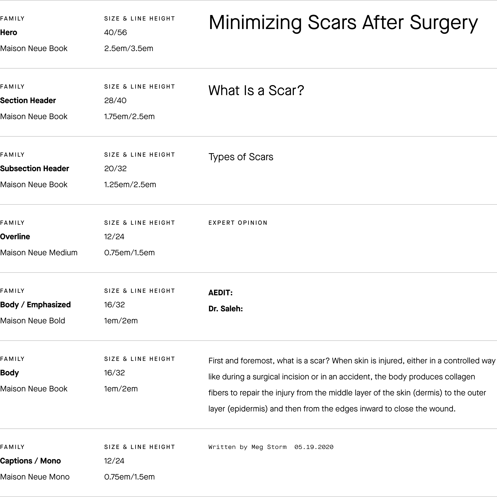
3. Compiling the library
Even if we would design under the same style guide that does not mean we would use them in the same way. To make sure everyone in the team speaks and understands the same design language, we need to compile a “dictionary” for it.
Good documentation serves to define and communicate the visual design, user experience and engineering values. This would allow other team members and new colleagues to quickly adopt the platform, and work in harmony with each other. The lead product designer and I worked together to ensure all documentation was consistent and easy to understand.
Creating the components
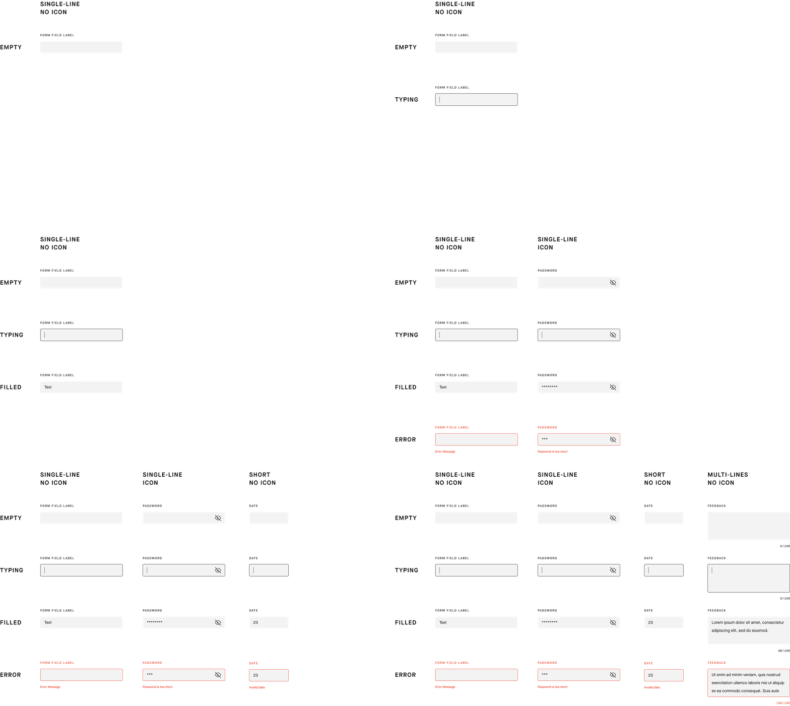
When it comes to creating the components - such as buttons, inputs / form fields, selects and toggles - the biggest challenge is how to handle the various states and sizes.
For example, there are different sizes and types of form fields across the product: single-line, multi-lines, short, with or without icons; and each of them includes 4 states: empty, typing, filled, and error. The number of components can balloon quickly, and it would become difficult to find the exact component we need.
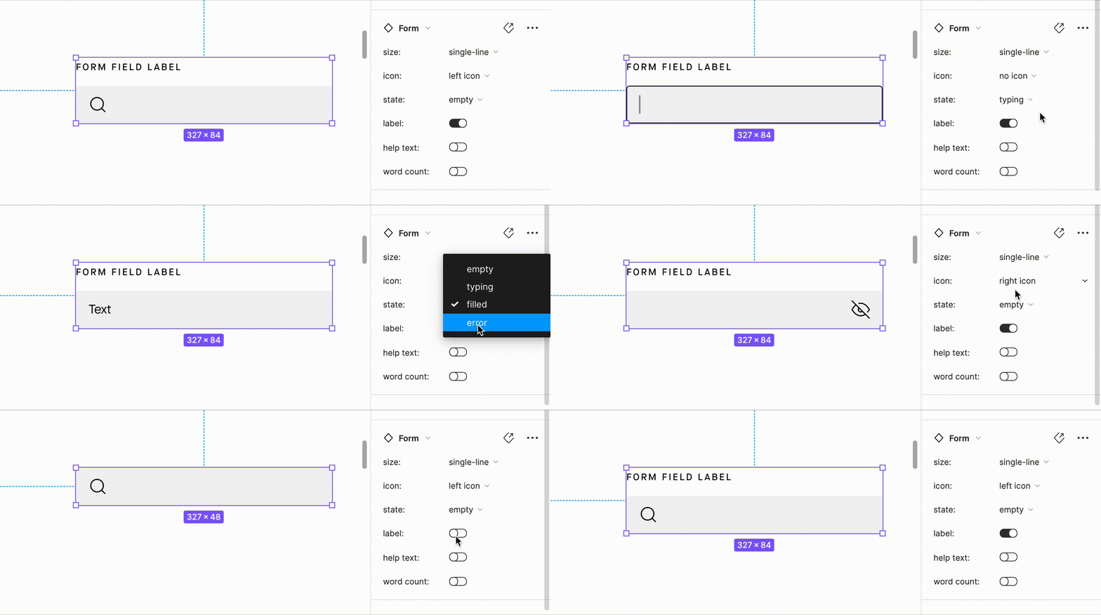
Fortunately, Figma has an elegant solution for this problem - variants, which allows me to group and organize similar components into a single container. This simplifies our component library, takes the guesswork out of our design system and brings our components closer to front-end code.
Keep using form field as an example, I organize the multiple variants with 6 different properties: size, icon, state, label, help text, and word count.
Defining the patterns
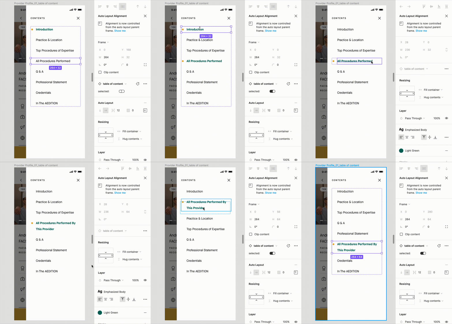
As we grouped the components, we gradually see patterns emerge. When single words come together to form phrases and sentences, they begin to make more sense. By utilizing auto-layout feature in Figma, we can easily swap, edit, or reorder the components without breaking the patterns.
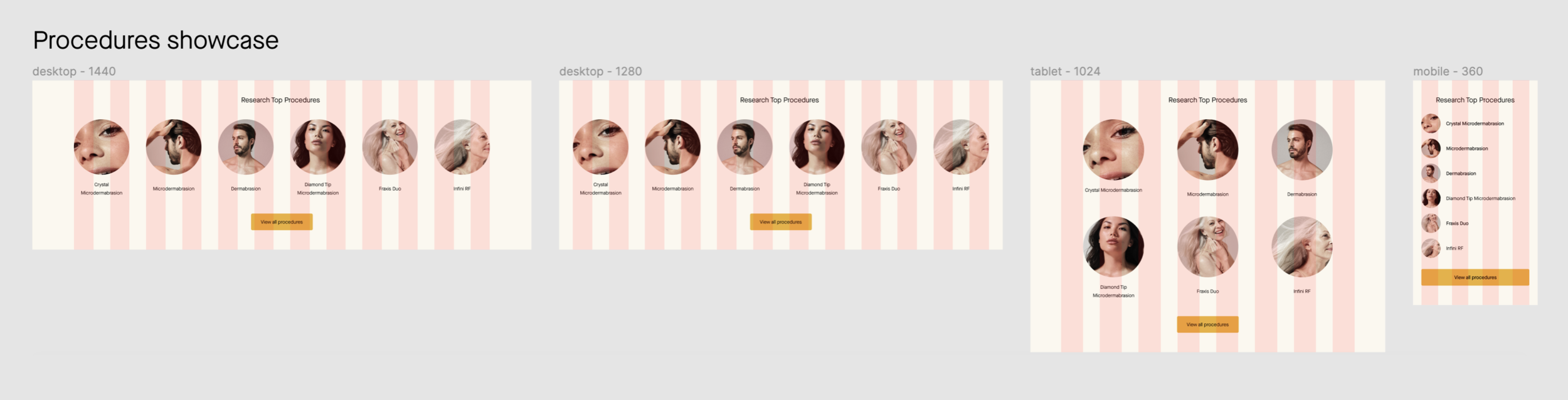
Design system is meant to be responsive. It’s important to make sure that the design (especially UI for the website) works at different screen sizes. There are different ways to set elements to respond as they grow or shrink in size using auto-layout. Thus we’re able to create basic responsive patterns.
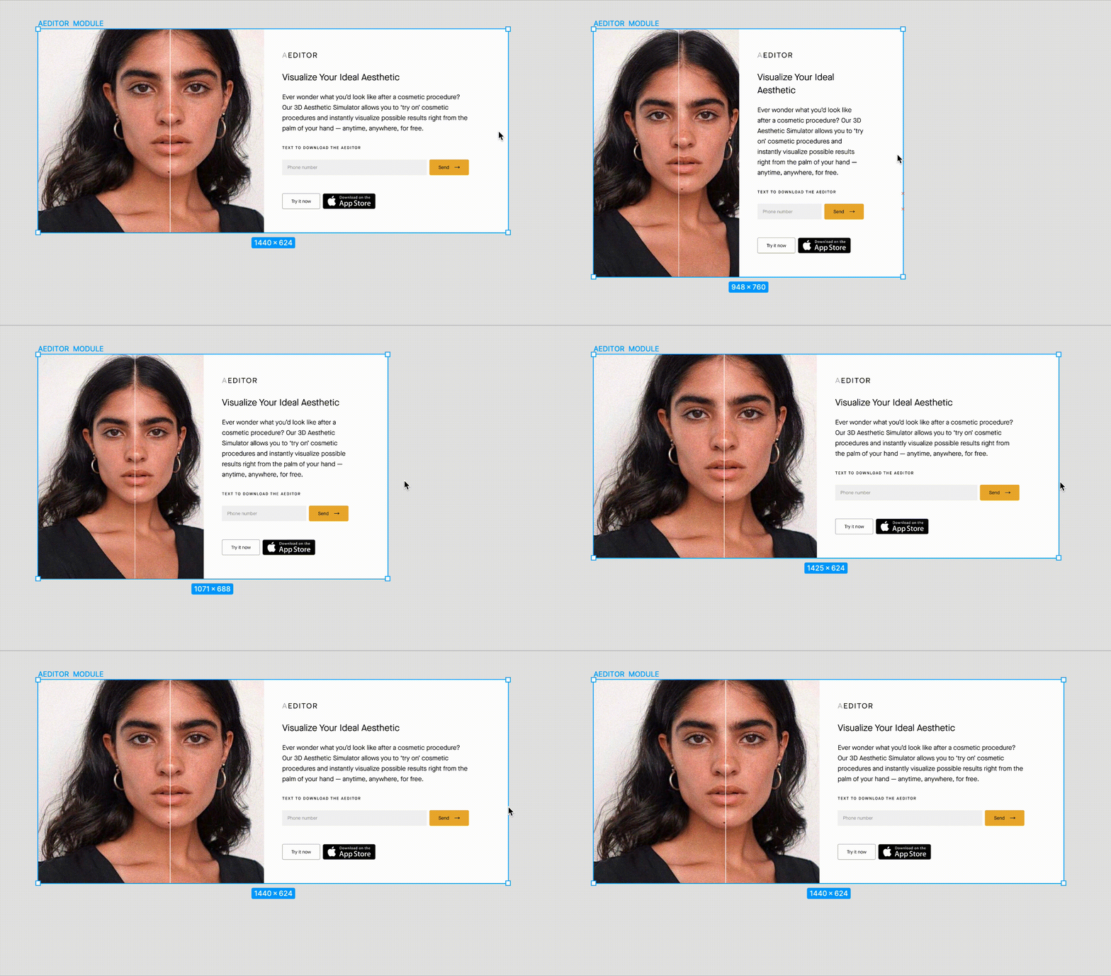
Auto-layout won’t help with breakpoints, so we defined them by introducing a unified set of principles and rules in our grid system. We also created some templates and examples of how components would work together at different screen sizes.
4. Application & amendment
““A system isn’t a project with an end, it’s the origin story of a living and evolving product that’ll serve other products.””
Like a language, design system is always changing, evolving, and adapting to the needs of its users. As the product iterates, new components are created, the usage of old components drifts, and old patterns develops or decays. Since a product is never done, the creation of a design system is merely the first step in a long journey.
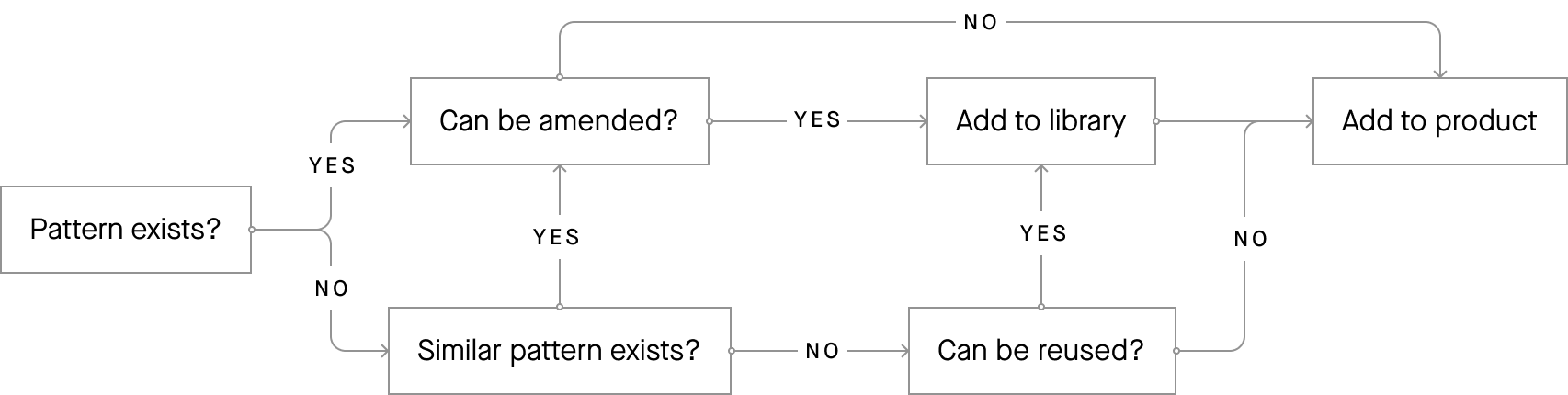
As the new features added to the products, gaps will inevitably emerge where the needs of the application aren’t solved by existing patterns. In such cases, it will become clear that existing patterns need to be amended, or new patterns will need created to address these needs.
However, if every new solution results in a new pattern in the library, the design system will become an uncontrollable Behemoth. It’s worth asking if this is a one-off solution or something that can be leveraged in other situation. So we mapped out the decision process to manage updates and additions to the patterns in our design system library.
Conclusion
This design system has been released internally and now lives in our Storybook and Zeplin. It is currently being used to facilitate the app redesign and the website builds. This project is still (and probably will always be) an on-going project as the products evolve, but so far, it has enabled the whole team to build better and faster, and collaborate more efficiently by using the common language. It has also improved the onboarding process for new designers and developers as the team grows fast.