Building AEDIT’s Design System
Date
03/2020 - 04/2021
Company
AEDIT LLC
My role
Lead product designer
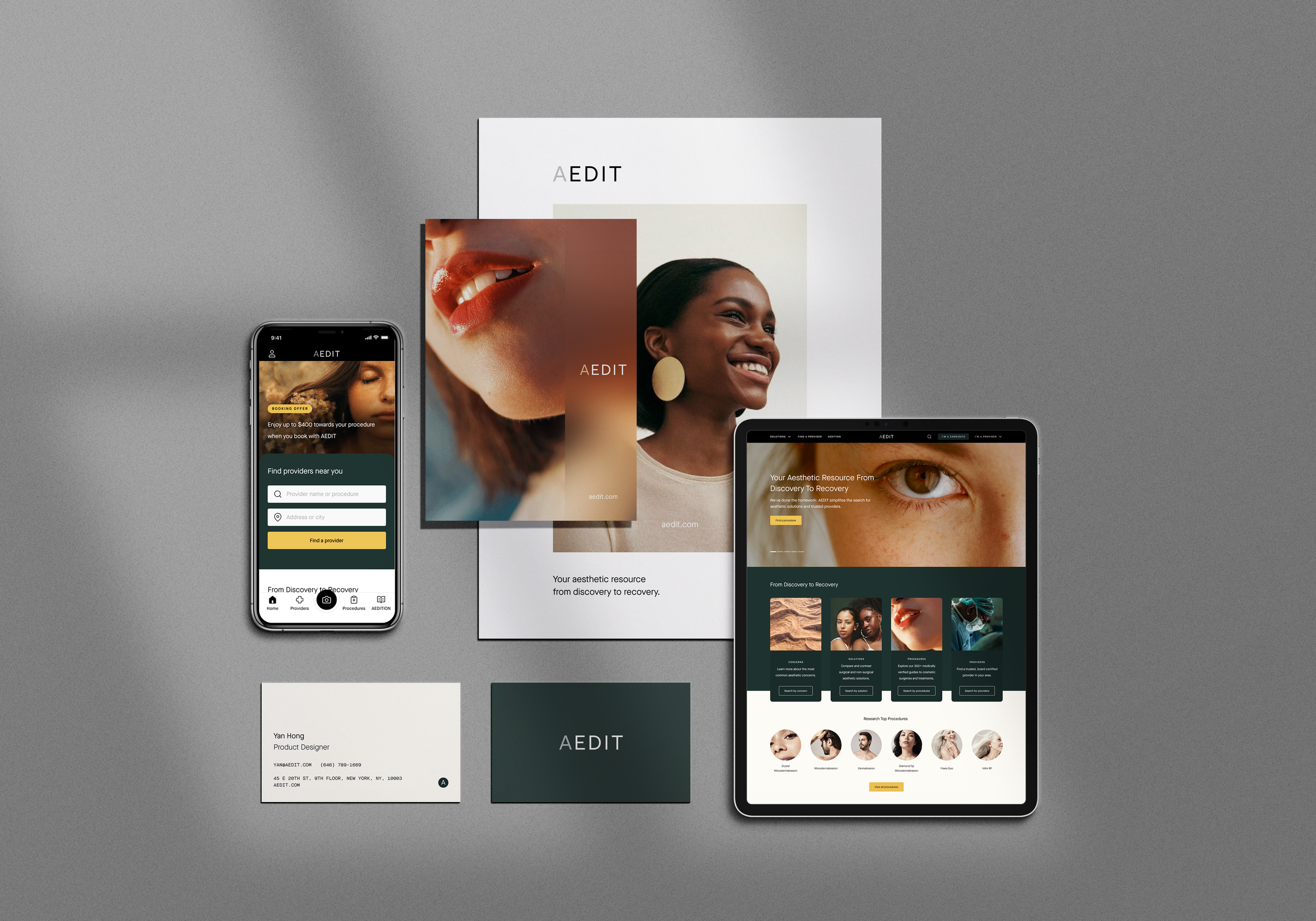
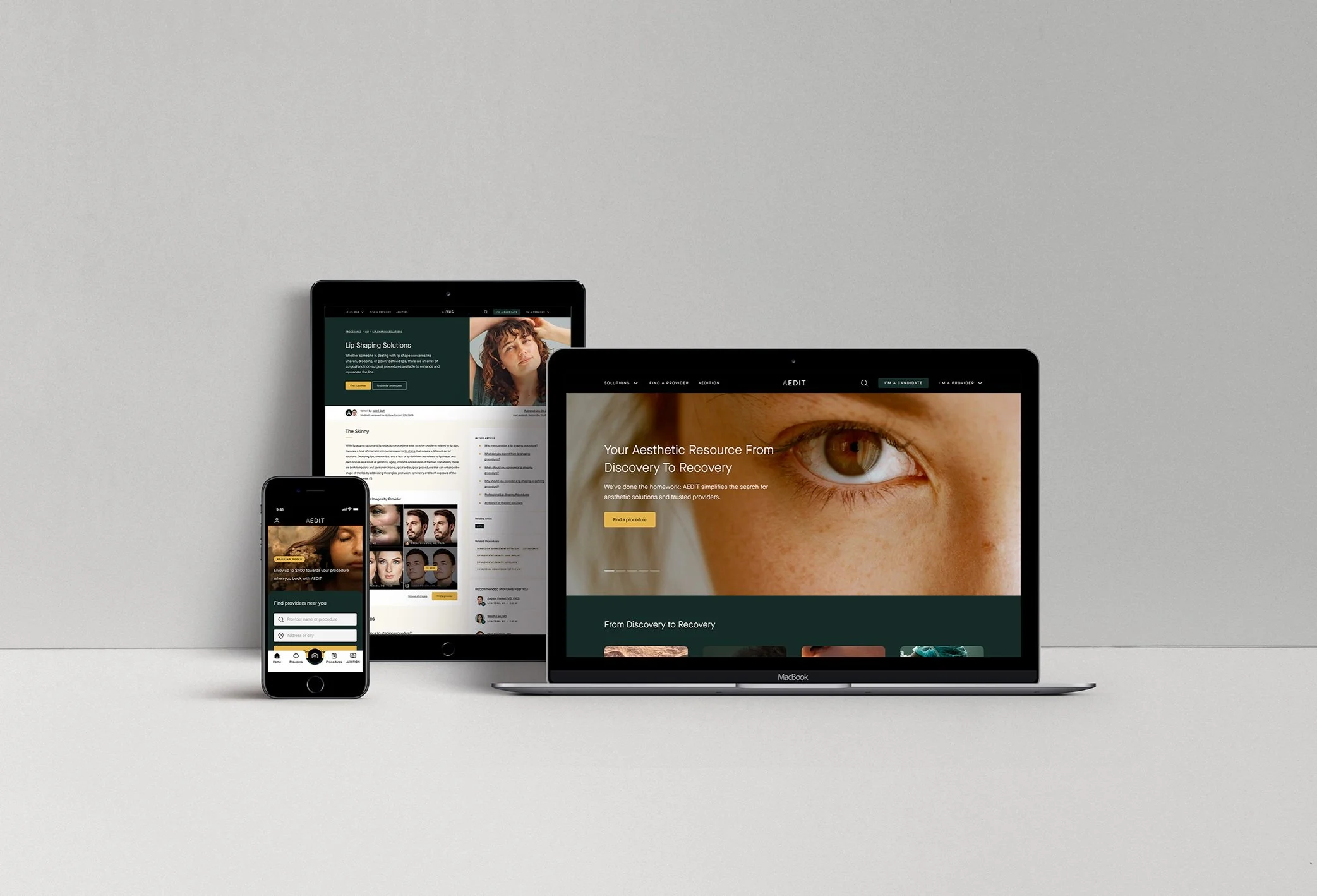
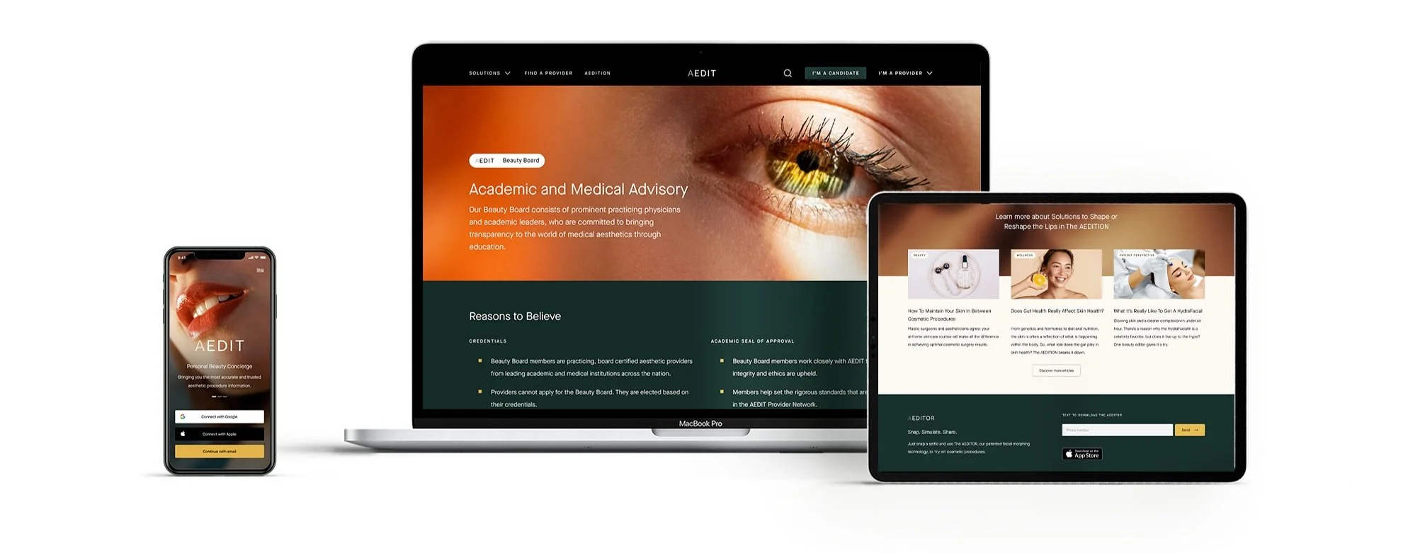
AEDIT provides beauty content and uses patented simulation and AI technology to help users visualize how cosmetic procedures may change their appearance.
As the product expanded and new features were introduced, inconsistencies began to appear across screens, components, and visual styles.
To address this, I designed and built a design system library to unify visual language and interaction patterns across the platform, improving product consistency and enabling faster collaboration between design and engineering.
Where we started
AEDIT’s product team initially consisted of two designers and a small component library built in Sketch.
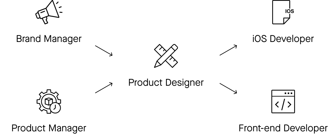
As the company grew, the design team expanded rapidly, bringing both new opportunities and new challenges.
Several changes made a scalable design system necessary:
Rebranding
In early 2020, the brand team initiated a rebranding effort to redefine AEDIT’s visual identity and voice, introducing new brand guidelines aligned with evolving business goals.Team expansion
The design team grew from a small duo into a cross-functional squad, increasing the need for shared design standards.From Sketch to Figma
We migrated our design workflow from Sketch, InVision, and Principle to a unified Figma workflow, enabling better collaboration and version control.

Process
To build a scalable system, the project followed four phases:
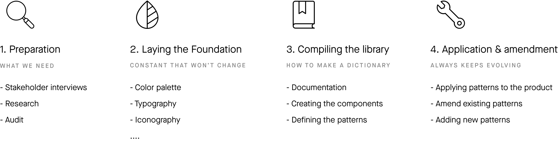
Each phase focused on establishing structure, defining reusable components, and integrating the system into product development.
Preparation
The first step was auditing existing screens and components to identify inconsistencies in visual styles, layouts, and interaction patterns.
By analyzing the product interface and collaborating with designers and engineers, we defined the key principles and requirements that would guide the system.
This phase ensured the design system addressed real product needs rather than becoming purely a visual framework.
2. Laying the foundation
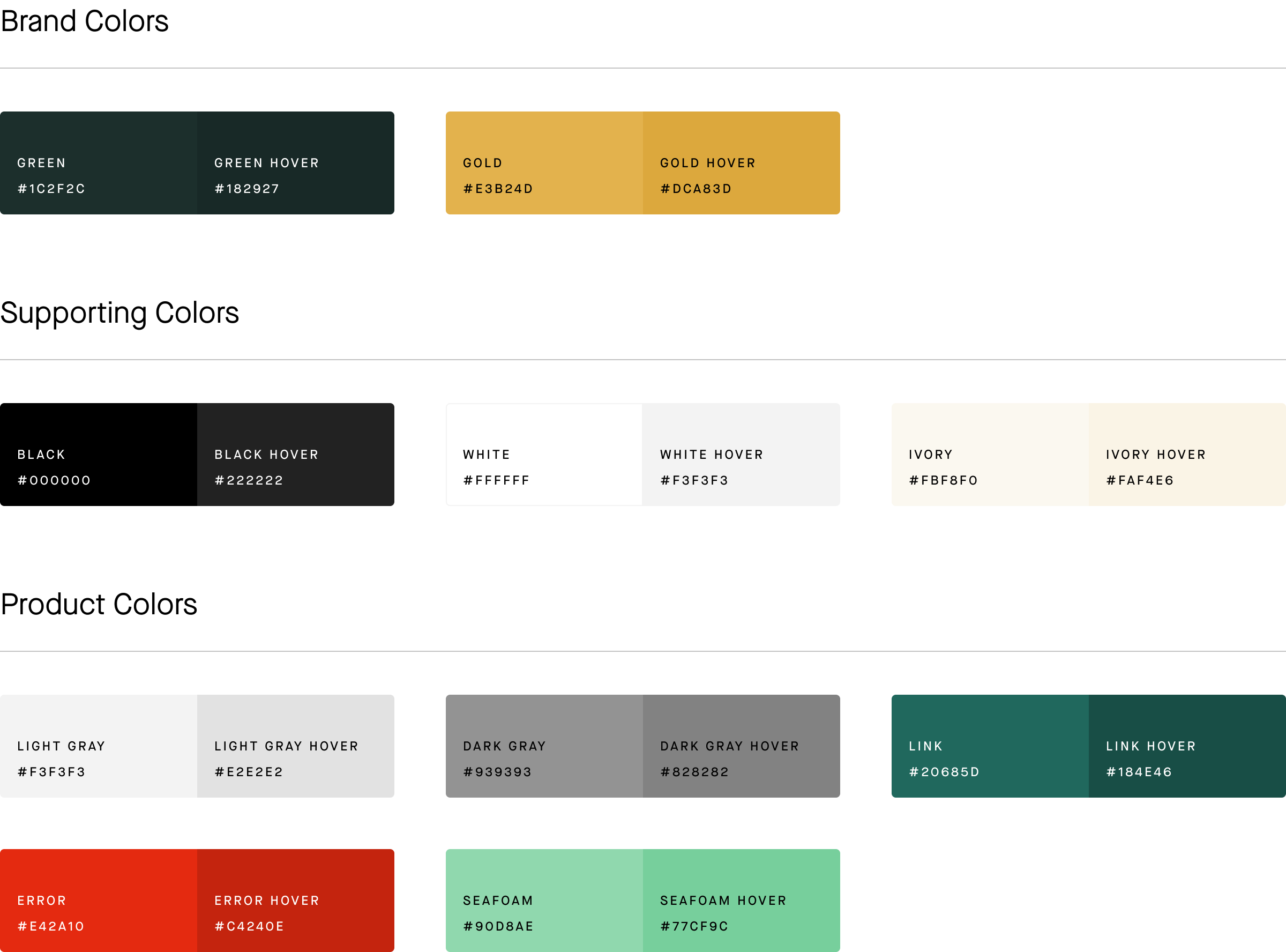
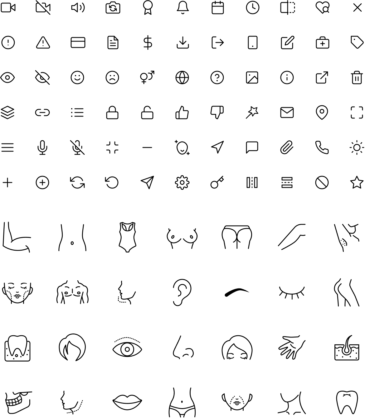
With the core principles established, I defined the foundational elements of the system, including:
color system
typography hierarchy
iconography
layout and spacing rules
These elements created a consistent visual language and provided a solid base for building reusable components.
Iconography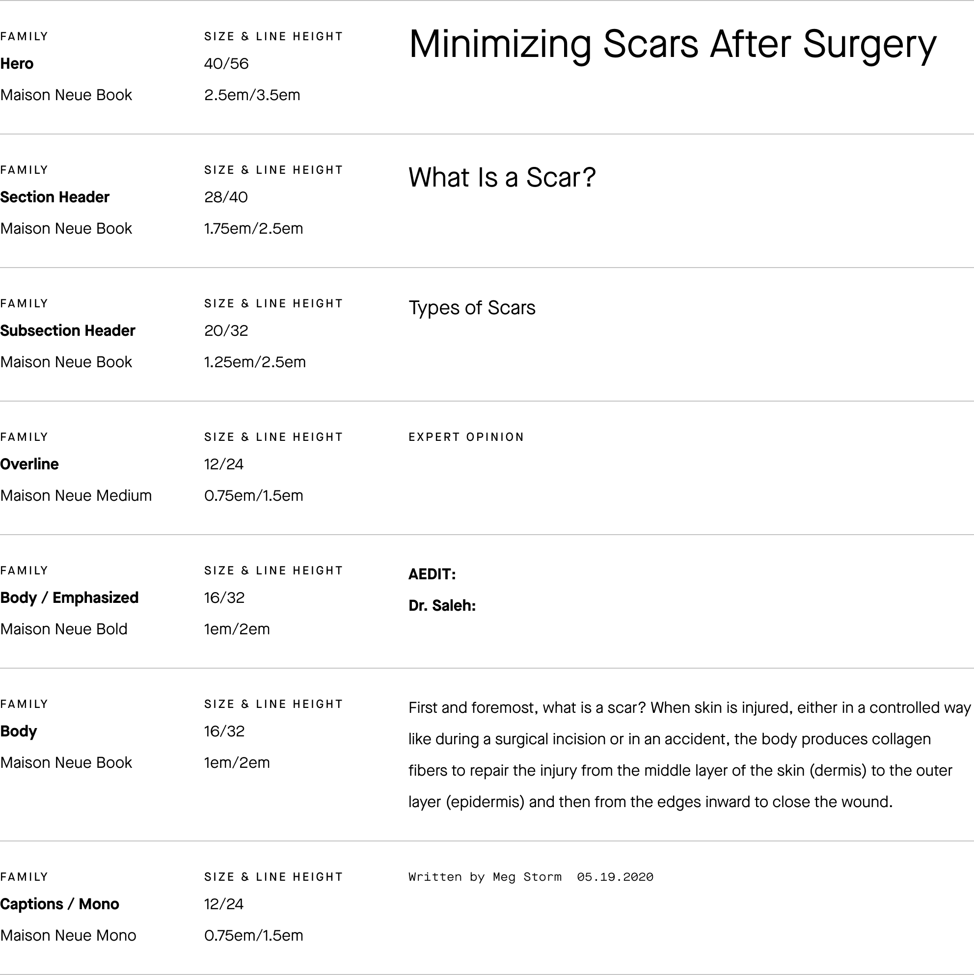
Typography3. Compiling the library
After defining the visual foundation, the next step was translating design principles into reusable UI elements.
This phase focused on organizing the component library and structuring patterns so designers and engineers could easily reuse them across the product.
Creating the components
Core UI components were designed and documented to support common product interactions, including buttons, forms, navigation, and content modules.
Each component was built with flexibility in mind, allowing it to adapt to different layouts while maintaining visual consistency across the interface.
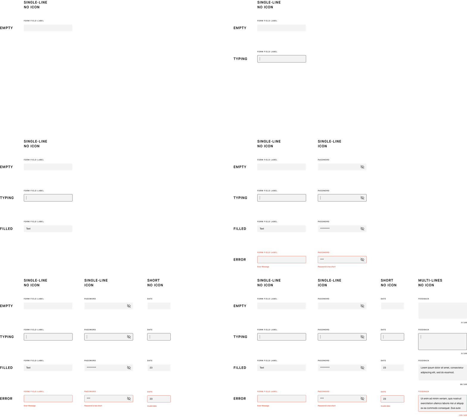
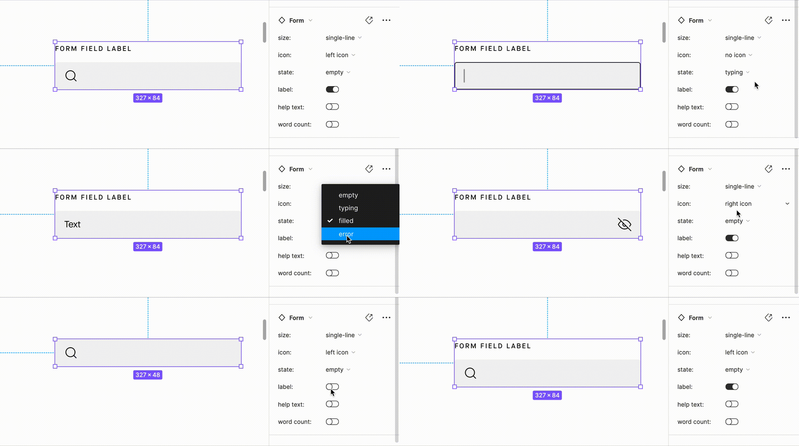
Components were built using variants to support different states and configurations within a single structure.
This approach reduced duplication, simplified component management, and allowed designers to quickly switch between variations such as size, state, and layout.
Defining the patterns
As the product continued to grow, more complex interaction patterns began to emerge.
To maintain consistency, we documented reusable patterns and layout rules that could be applied across different product scenarios.
These guidelines ensured new features followed the same design logic while remaining flexible enough to support future development.
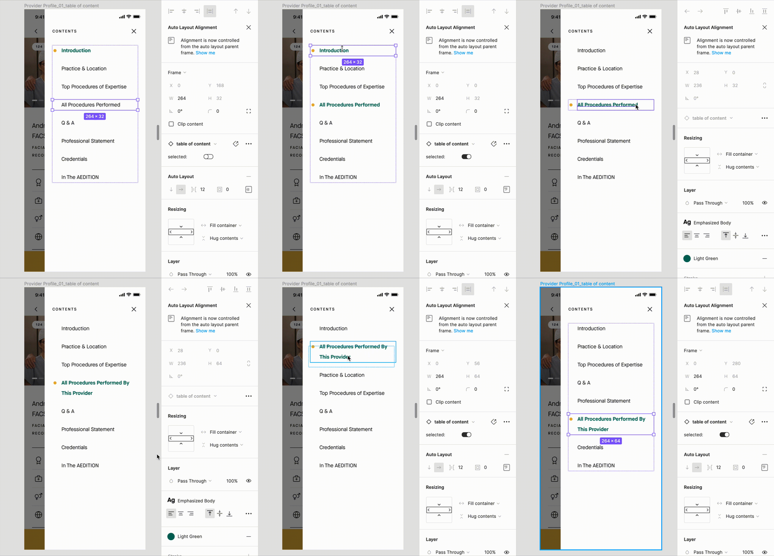
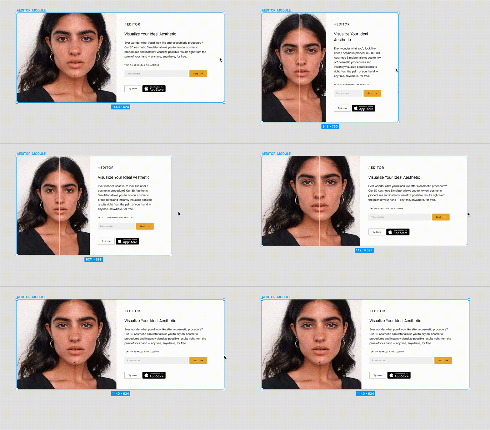
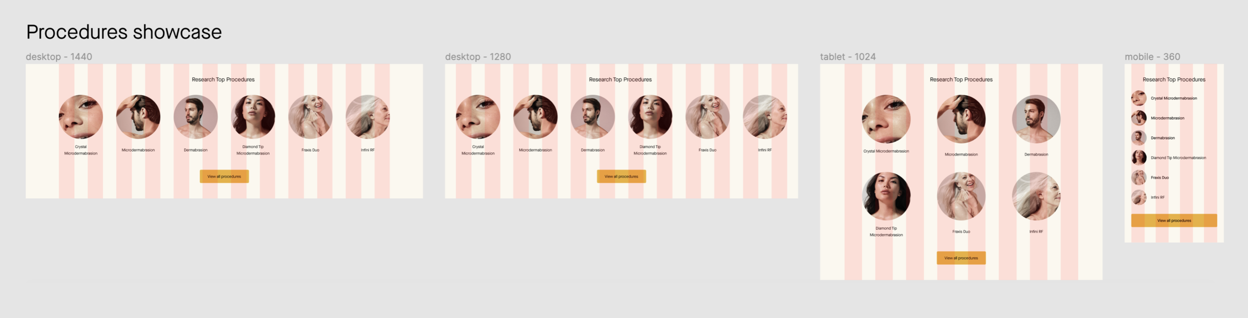
Auto-layout was used to ensure components adapt seamlessly across different screen sizes while maintaining consistent spacing and alignment.
4. Application & amendment
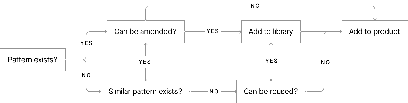
A design system is not a static project but an evolving product.
As new features were developed, components and patterns were continuously evaluated and refined.
This iterative process ensured the system remained adaptable, practical, and aligned with the product’s ongoing evolution.
Conclusion
This design system created a shared foundation for AEDIT’s product development.
By improving consistency, reducing redundant design work, and strengthening collaboration between design and engineering, the system enabled the team to build and iterate faster as the product continued to grow.